Health disparities and other News & Views from a quarantined scientist
Published:
Today’s blog post comes to you as I hit the three week mark since the last time I was within 6 feet of another human. This isn’t a sacrifice, it is my responsibility as a citizen with privilege to stand in solidarity with those throughout our society who are suffering. I have friends who are health care professionals treating COVID-19 patients without proper PPE, I know people who have lost loved ones to COVID-19, and I know people who have lost jobs. And these are largely people with a lot of privilege.
I am also seeing decades of unaddressed health disparities multiplying the pandemic’s effects in cities I love like Detroit, Michigan. Health disparities remain a complex issue with a body of scientific literature but few robust solutions. Unfortunately, the same co-morbidities and chronic conditions that increase COVID-19 complications and fatalities (heart disease, diabetes, and lung disease) are the same ailments that concentrate in communities that have been historically disenfranchised and face systematic racism, food insecurity, under-insurance, etc. How do you follow CDC recommendations for hand washing when your water is cut off? You can educate yourself on health disparities here. You can read about health disparities in the face of COVID-19 here and here.
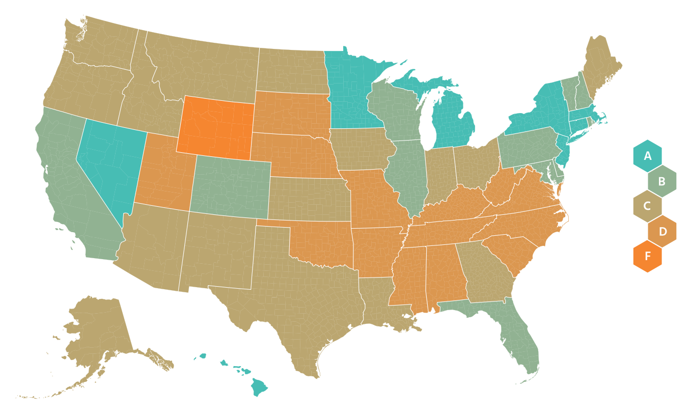
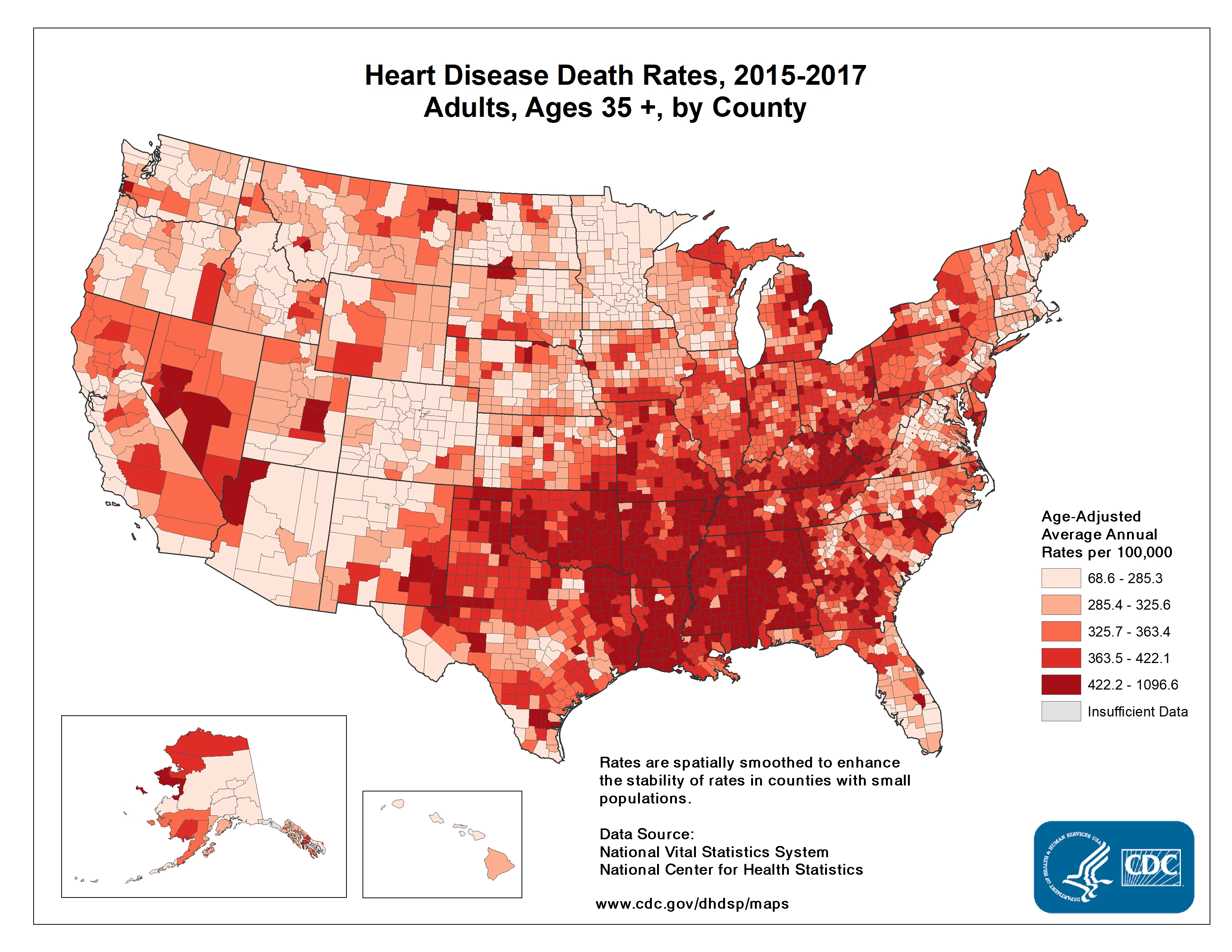
I worry about the effects of COVID-19 on the entire southeastern U.S. which has major health disparities when compared to the rest of the country. The CDC’s 2013 Health Disparities and Inequality Report stated “There are also marked regional diffences, with much lower life expectancy among both white and black Americans who live in the Southeast.” By using human mobility data to monitor the success of social distancing, we see the Southeast is clearly late to the game. The NY Times used anonymous cellphone data to visualize what parts of the U.S. experienced closer to normal travel in late March. Google is generating nice mobility reports. A company called unacast created a social distancing scorecard, shown below on the left. On the right are the CDC’s observed heart disease death rates across the US. These also tend to be highest in the Southeast, often in the same areas of the country who are slow to adopt aggressive social distancing measures. This same trend is seen for other chronic conditions like diabetes. I can tell you now this doesn’t bode well for COVID-19 outcomes. Early data and reporting by The Atlantic already suggests that fatality rates for cases under 70 years of age are higher in the South. Even if you feel removed from the crises in other regions of the U.S., there is likely community transmission of SARS-CoV-2 occurring in your area, and around ~19% of persons infected today will need hospital care in about 10-14 days.
 |  |
As you consider ways you can help your own communities, I’d encourage you to consider donating to organizations that help communities of color like supporting businesses owned by minorities. You can support the Detroit Small Business Stabilization Fund here or check out ways to help small businesses in Durham, NC. Consider advocating for equitable aid with your elected officials. Let them know that the NAACP has released resources to guide officials.
Governor Gretchen Whitmer (aka “That Woman from Michigan”) was on The Daily Show with Trevor Noah on April 1. She said 40% of Michigan residents live below the ALICE standards. The Michigan Association of United Ways has an effort, The ALICE Project to help these families. The United Way of Southeastern Michigan serves the counties in Michigan hardest hit by COVID-19 and has a COVID-19 Community Respond Fund (and a pretty good score on Charity Navigator). Finally, if you have the privilege to stay home and avoid becoming sick yourself, you’re helping to save resources and aid for the more vulnerable, the communities we have left susceptible to health disparities for decades.
I have a backlog of scientific papers I’ll summarize next time. For now, here are the News & Views from a quarantined scientist:
The federal Coronavirus task force finally released their projections for estimated deaths in the U.S. from the pandemic: 100,000 to 240,000. You can watch Dr. Tony Fauci explain the fatality predictions on CNN’s State of the Union. Dr. Deborah Birx concurred on the TODAY show. These estimates are from in-house models and the methods were not discussed so cannot be evaluated, but the methods were supposedly influenced by projections made by the University of Washington’s Institute for Health Metrics and Evaluation. You can see the IHME per-state and national projections for bed-days, ICU-days, ventilator days, and deaths in the US. You can read their methods in the pre-print. An in-depth view of the model’s assumptions, including a continuation of strong social distancing measures through June 1, is in this interview. As any good statistican knows, the models are only as good as the assumptions they’re built on. In my home state of North Carolina, as of today, they project 1,534 deaths by August 4, 2020 and a shortage of 213 ICU beds. This is a more favorable projection than that from a few days earlier in the original story by the Raleigh, NC News & Observer.
I’ve noticed that constantly shifting predictions like this may give the general public a sense that scientists and statistical models shouldn’t be trusted, or that “the media” is inflating predictions to stoke panic. The numbers of cases and deaths are a complex function of a lot of factors, and we can estimate them by statistical models. The models are constantly revised as we learn more about the factors (or parameters) that define the models. For example, we can update the case fatality rate as we see what happens in European countries and in the U.S., particularly when health systems are overwhelmed as they are in NYC. As we see the effects of social distancing on viral transmission, the doubling rate of cases can change. Michigan Medicine projects social distancing by 50% of the population changes the current doubling time of 3 days to 7.7 days. This is a good thing—it means the number of cases will now double in a week as opposed to just a few days. All of these factors will continue to change and scientists will continue to update the models based on real-world observations, thereby changing the final projected number of cases and deaths and the associated timeline. The theoretical framework underlying the models is robust and has been developed by scientists, vetted by peer-review, and scrutinized by more scientists. The Washington Post reported the government has worked with a group of about 50 epidemioloists and math modelers at universities over the past decade. These experts have trained all their lives, and many are paid by tax-payer supported biomedical researcher grants. They’re doing the job you’re literally paying them to do…please trust them! The journal Nature published an in-depth special report on epidemiologists’ modelling efforts. The purpose of the models should be to guide policy in an evidence-based way, and to make the best decisions with the information we have at hand now.
A National COVID-19 Convalescent Plasma Project has been launched so that those who have recovered from the disease can register to donate plasma as a potential treatment for current patients (aka convalescent plasma therapy). Early research on a SMALL sample (N=19) in China demonstrated that plasma infusions from recovered patients, which presumably contain pathogen-fighting antibodies, could be effective. This method has been authorized for Compassionate Drug Use, and hopefully proper clinical trials will prove its efficacy. Read the story here.
A digital thermometer company is harnessing big data to view the pandemic. The NY Times reported “In three cities analyzed by Kinsa, simply declaring a state of emergency or limiting the size of public gatherings did not affect the number of people reporting fevers. But closing restaurants and bars and asking people to stay in their homes produced significant results.” Check out Kinsa’s US Health Weather Map.
Researchers have launched a study to examine global attitudes around the pandemic. It takes about 5 minutes, and I would encourage you to take it!
Researchers at Harvard, King’s College London and Zoe Global Ltd, with funding from the UK National Health Service and the Wellcome Trust, launched a mobile COVID Symptom Tracker app which was deployed in the UK on March 24, 2020, garnering over 1 million downloads in just 48 hours. They have just deployed a US version of this app. The data will be securely stored, de-identified and used for aggregate population-level studies. Data from you, even if you are well, can help researchers identify viral hot spots, new symptoms, high risk populations, etc. Please note that this is different from other apps currently available which are symptom screens used to direct people to seek medical care. No medical advice is provided through this app.
You can view view COVID-19 fatality rates per-country over time. Hit play to see how the countries’ rates have changed over time. You can see the grey region of 1-4% is what we are largely seeing for COVID-19. And you can compare this to the case fatality rates of other diseases like SARS (11%). Case fatality rates can be be higher than those actually biologically necessitated by the virus because overwhelmed health care systems will have poorer outcomes.
Speaking of burdened health care systems, a sobering piece about the toll the virus is taking on health care workers.
The US government has extended federal social distancing guidelines to April 30. This was a win in my eyes, despite national grumbling to the contrary, including from an ill-informed law professor who fancies himself an epidemiologist. (Fun fact, research has demonstrated that people who know the least about a topic often believe that they know the most. Read more about the Dunning-Kruger effect here)…
In all seriousness, how to balance the economic downfalls of a shut down with its life saving benefits is an important point of discussion that our leaders should be tackling. The NY Times worked with epidemiologists to create a model illustrating the number of lives at stake across various durations of social distancing. This model is not perfect, but I think the take home lessons are useful. An excerpt:
“Anyone advising the end of social distancing now needs to fully understand what the country will look like if we do that,” cautioned Dr. Tom Inglesby, a health security expert at Johns Hopkins University. “Covid would spread widely, rapidly, terribly, and could kill potentially millions in the year ahead, with huge social and economic impact.”
We can learn a little from Hong Kong, which had very few cases but saw a resurgence upon lifting restrictions. Luckily, expert economic panelists agree (39%) or strongly agree (41%) that abandoning severe lockdowns at a time when the likelihood of infection resurgence remains high (aka now) will lead to greater total economic damage than sustaining lockdown. You can see more professional opinions and added nuances here. For more background, the Initiative on Global Markets (IGM) maintains an Economics Experts Panel (called the IGM Panel for short) comprising leading economists at top United States universities.